
Easy Responsive Grid
Today we’re going to be looking at how to make a super-easy-to-implement, responsive, grid layout. Grid layouts are a very common design pattern for displaying an array of data in a visually appealing way. Whether it’s a photo gallery, or an array of card tiles, knowing how to build a layout like this is an awesome skill to have as a front-end developer.
Let’s start by looking at the final result of what we’ll be building: a grid! Try resizing the window to see how the grid items will automagically wrap to new lines and the number of columns in the grid will update.
Let’s start by setting up some example markup, then we’ll walk through the css line-by-line.
<div class="container">
  <div class="item">1</div>
  <div class="item">2</div>
  <div class="item">3</div>
  <div class="item">4</div>
  <div class="item">5</div>
  <div class="item">6</div>
</div>
This HTML is pretty straightforward. First we have a “container” div. This is the div on which all the grid styles will be applied...
Within the container we have children divs, each with a class of “item”. You can imagine these grid items could be photos, links, or anything else you might want to display in a grid layout.
Now let’s add the css to make this a responsive grid.
.container {
  display: grid;
}
The first thing we’ll do is set display: grid; on the parent container element. This tells the parent to display all of its children according to the two dimensional grid system. Setting this line of css will not change the way anything looks. In order for the grid to actually begin taking shape, we need to define rows and columns.
.container {
  display: grid;
  grid-auto-rows: 100px;
}
Here we are setting all of our rows within the grid to have a default height of 100 pixels.
With CSS grid, it is common to see rows defined with the grid-template-rows property. This lets you specify how many rows your grid should have, and what height each row should occupy. For example, if you were to have grid-template-rows: 100px 50% auto;, this would tell the grid to have its first row fill 100 pixels, the second row fill 50% of the available space within the container, and the last row to fill only the space necessary to fit its content.
Now let’s say you only explicitly defined one row by setting grid-template-rows: 100px; ... How much space will items take up if they have to wrap to a new row within the grid, but there is no explicitly defined row height? Well, by default they would be set to auto so that it will display all the content. However, you can override this default height for implicitly created rows using the grid-auto-rows property. That is what I’m doing above. Essentially, I don’t want to explicitly define how many rows are in the grid, but I want every implicitly created row to be 100 pixels tall.
Now let’s get to the really awesome one-liner that makes this grid fantastically responsive... Let’s define our columns!
.container {
  display: grid;
  grid-auto-rows: 100px;
  grid-template-columns: repeat(auto-fit, minmax(200px, 1fr));
}
grid-template-columns behaves exactly the same way that I described grid-template-rows except it lets you define how many columns you want your grid to have, and how wide each column should be.
So if I were to write grid-template-columns: 200px 10% 5rem; , my grid would then have its first column be 100 pixels wide, the second would fill 10% of the available width of the parent container, and the last column would be 5 rems wide.
There is one new unit that can be used when defining grid rows and columns that you should be aware of. It is the “fractional unit”, denoted with fr . A fractional unit works very similarly to how the flex-grow property works within a flex container. Specifying 1fr basically says, “fill up whatever space is remaining in the container”.
If I were to use a fractional unit when specifying my grid columns, it might look something like this: grid-template-columns: 100px 1fr;. This would make the first column in my grid 100 pixels wide, and the second column would take up all the remaining available width in the parent container.
But what if I defined more than one column with a fractional unit? Let’s say I had a grid with the following defined columns: grid-template-columns: 100px 1fr 2fr;. In this case, the first column would still take up 100 pixels, but all the remaining available space would get divided up among the latter two columns, with twice as much of the available space going to the third column. So if my grid container was 400 pixels wide, and I defined the same columns as above, the first column would be 100px wide, the second would be 100px wide, and the third would be 200px wide.
But what’s this repeat() and minmax() stuff all about?
Repeat is a CSS function that lets you define multiple columns or rows in a shorthand way. Instead of defining 5 columns like this: grid-template-columns: 100px 100px 100px 100px 100px;, you can do this, grid-template-columns: repeat(5, 100px);. The first argument is how many times you want the value(s) to be repeated, and the second is the value(s) to be repeated.
Minmax is another CSS function used with grids. It lets you specify a range of space that rows or columns can occupy. The first argument is the minimum width or height for your column or row and the second argument is the maximum. For example, grid-template-columns: 100px minmax(100px, 1fr); would define the first column to always be 100 pixels wide, and the second column would fill all the remaining space, but never shrink below 100 pixels.
The repeat and minmax functions can be used together to specify some number of columns or rows, each with a fluid width/height. grid-template-columns: repeat(12, minmax(100px, 1fr)); would define twelve columns, each taking up an equal amount of available width. However, none of the columns would shrink below 100px, so you can imagine how all of these columns would not fit on a smaller screen and would result in overflow.
So how do we make the number of columns variable so that the grid can grow/shrink depending on the size of the user’s screen? Thankfully, CSS grid has two handy values we can use for defining responsive rows and columns. These values are auto-fit and auto-fill.
Let’s start by explaining how auto-fill works. When you use ‘auto-fill’ as the first argument to the repeat function, it will fill the grid container with the largest possible number of columns that can fit into sed container without overflowing. The key thing to note about auto-fill is that if you have a grid with enough space for more columns than there are items within the grid, auto-fill still creates empty columns, thus “filling” the available space with as many columns as it can.

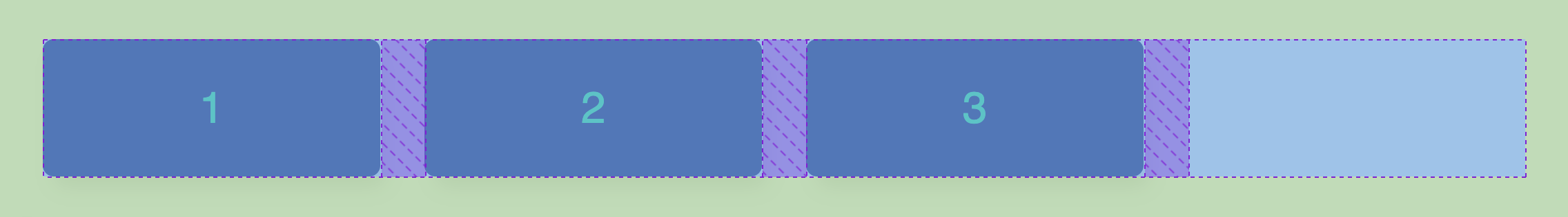
Here’s an example of using auto-fill, but not having enough children to occupy all the created columns. As you can see, it still creates an empty column. Auto-fill basically says, “Add as many columns as I can without overflowing, even if the columns are empty!”.
Auto-fit works the same as auto-fill in that it tries to add as many possible columns as can fit without overflowing. The only difference is that it will collapse any empty columns to fit the actual content into the grid nicely. Here’s the same grid, as the image above, but with auto-fit instead of auto-fill:

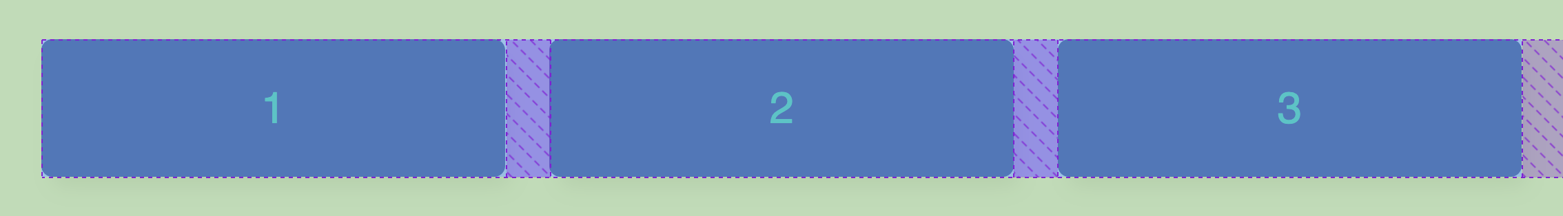
Technically speaking, there are still four columns in this grid... the empty columns have just been collapsed. This is the key distinction between auto-fill and auto-fit: how it handles empty rows/columns. This might be confusing at first because when you have enough grid items to fill all the possible columns, auto-fill and auto-fit behave exactly the same. The only visible difference can be seen when you have more rows/columns than grid items. If you want a better explanation of the difference between auto-fit and auto-fill, I highly recommend this css-tricks article!
Wow, that was a lot of explanation for one line of CSS! But now we have a good understanding of what grid-template-columns: repeat(auto-fit, minmax(200px, 1fr)); is really doing. It basically will fill our grid with as many columns that can fit without overflowing, where each column shares an equal amount of the available width, but never shrinks below 200 pixels. Whew!
The only additional thing I’ve added to our grid is spacing between the items.
.container {
  display: grid;
  grid-template-columns: repeat(auto-fit, minmax(200px, 1fr));
  grid-auto-rows: 100px;
  grid-gap: 2rem;
  padding: 2rem;
}
The grid-grap property specifies how much space should be between the rows and columns. If you wanted the spacing between the rows to be different than the spacing between the columns, you could use the individual row-gap and column-gap properties to accomplish this.
Then I simply added some padding around the grid to match the grid-gap... And just like that, we have a beautifully responsive grid!